Client:
Project:


Client:
Project:
Website:
{↑} OCR-D forms the backbone of the DEMO identity. Its monospaced structure creates a consistent framework in which characters can be easily interchanged, enabling a flexible system of evolving typographic constructs. This modular approach supports a wide range of compositions, allowing the identity to shift and adapt while maintaining a clear and recognisable visual language.
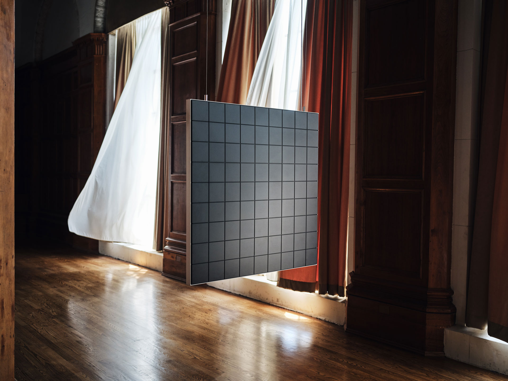
{↑} Layer hardware design by DEMO. Featured work "Richter" by Leander Herzog and Richard Nadler. Photography by Glauber and Drew Herrmann.
{→}{↓} Inspiration: OCR-B, designed by Adrian Frutiger in 1968, an early Optical Character Recognition typeface created to be legible for both machines and humans.
{↓} OCR-D Character set.

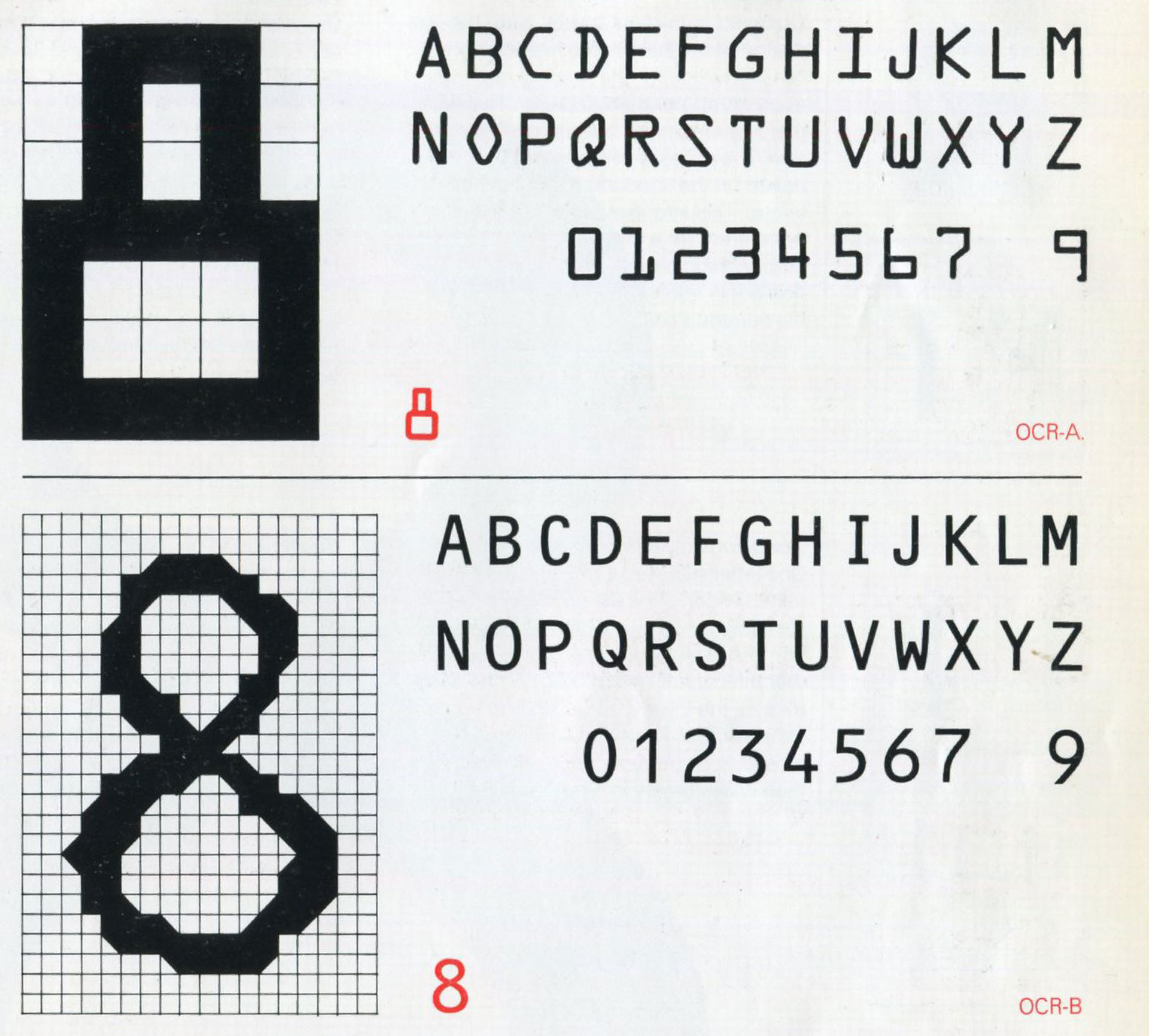

{↑}{↓} OCR-D Character set.
{↑} The DEMO typographic constructs are carried through to the website, where they become an active, generative layer of the experience. With each refresh, the system produces a new arrangement, introducing subtle variation while remaining anchored to the underlying grid. This continual reconfiguration keeps the interface dynamic and engaging, reinforcing the identity as something responsive and evolving rather than fixed.
{→}{↓} Layer hardware design by DEMO. Photography by Drew Herrmann.
{↑} Supporting typeface FPO by Corey Holms, is introduced to soften the more mechanical tone of OCR-D.
{→}{↓} The DEMO colour palette is deliberately non-tech in feel. Earthy, natural tones form the foundation, bringing warmth and tactility, while a carefully considered selection of pastel colours adds softness and subtle contrast. Together, they create a restrained yet expressive system that feels grounded, human, and intentionally removed from overtly technological associations.
{↑} Layering colour within the typography introduces an additional layer of depth and visual dynamism.
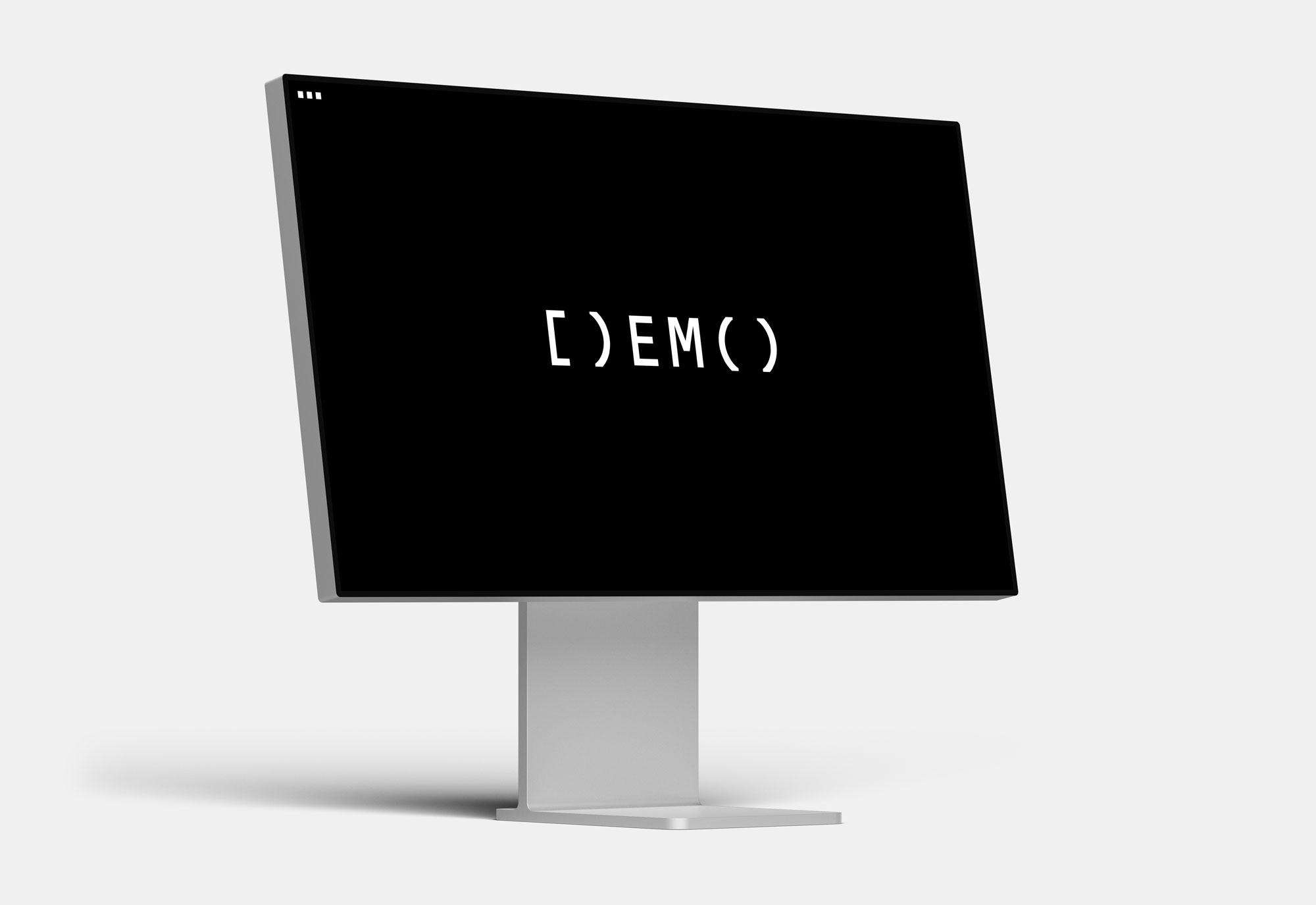
{→}{↓} Social media icons and assets use the brackets ‘[)’ in place of the ‘D’, offering a subtle reference to hardware. Both function as containers, enclosing and structuring information within a clear, modular system.


{←}{↑} Echoing the structure of code, its fixed-width system reflects the logic of coding environments, where alignment, repetition, and precision establish order. This framework enables typographic elements to be structured with clarity, resulting in compositions that feel both systematic and expressive.
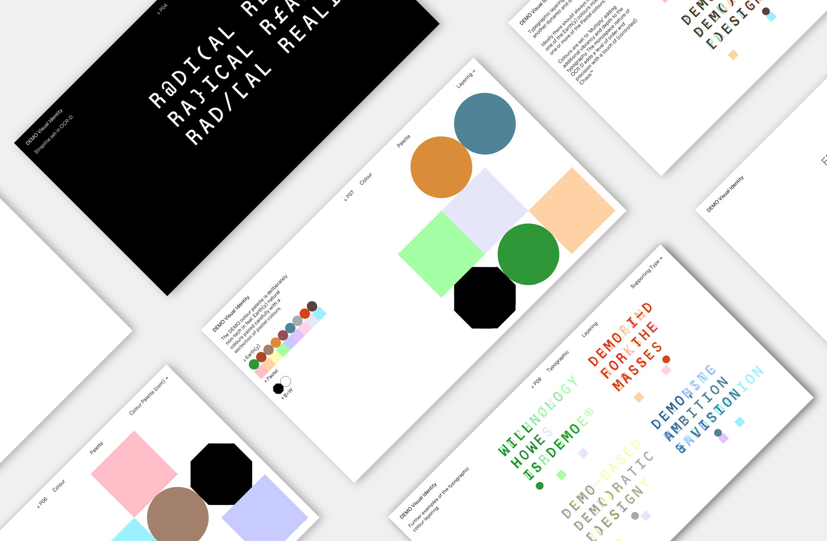
{↑} The DEMO brand guidelines establish a structured yet flexible system that governs how the identity is constructed and applied across all touchpoints. Rooted in a typographic and modular framework, the guidelines ensure consistency while allowing for controlled variation. Rather than prescribing rigid outcomes, the guidelines operate as a framework for construction, allowing the identity to remain coherent while evolving in response to content and application. This balance between structure and flexibility ensures the DEMO brand maintains clarity, consistency, and a distinctly system-led visual language.
{←}{↓} ASCII headshots function as both graphic devices and cultural references, introducing a human presence while remaining fully embedded in the logic of the system. The result is a distinctive visual layer that sits between portraiture, typography, and code.
{←}{↑} DEMO digital assets: Underlying this flexibility is a clear sense of rigour: every asset is governed by defined rules of construction, alignment, and spacing. This discipline ensures that even the most varied outputs remain anchored to a coherent visual language.
{→}{↑} Desktop website.
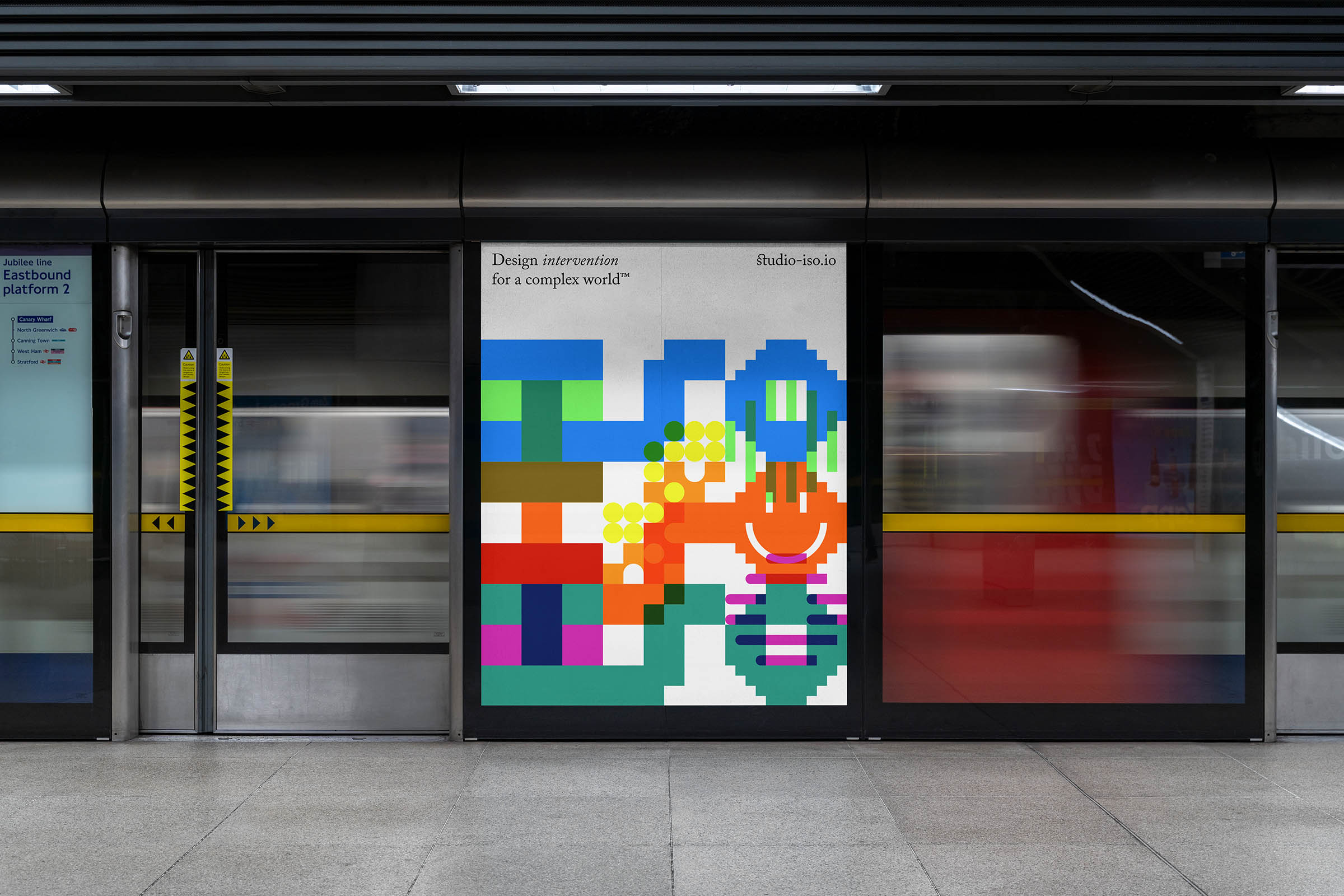
{↓} Digital billboard.