Client:
Project:


Client:
Project:
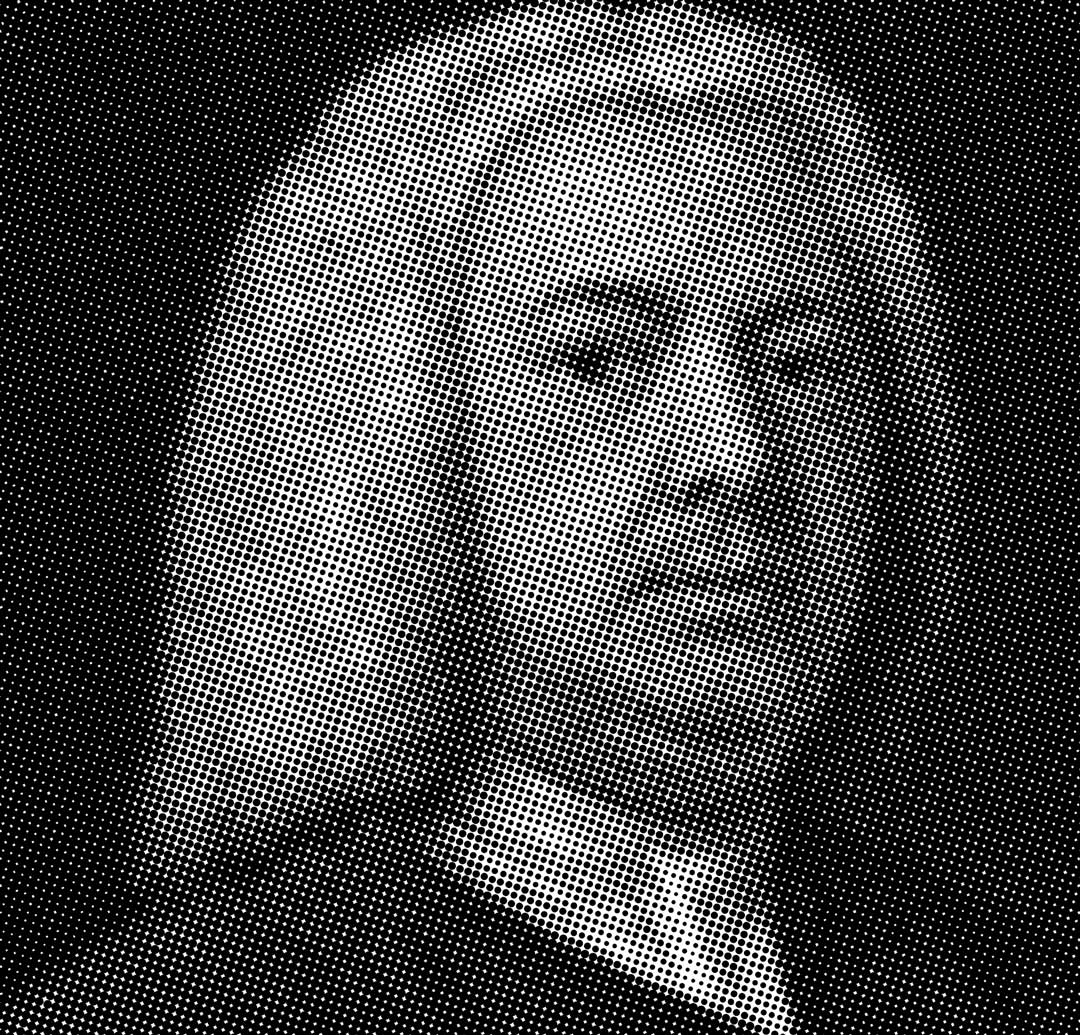
{↑} The ISO primary logo is constructed from three [3x3, 6x6 + 12x12] grids with each consecutive grid increasing in complexity.

{↑} Inspired by Powers of Ten by Charles & Ray Eames, the evolving definition of the logotype reflects the studio’s dual perspective—balancing expansive, big-picture thinking with a precise, macro-level approach to its work.

{↑} Inspiration: A custom, grid-based pixel typography rooted in brutalist principles—precise and uncompromising, paired with structured, grid-led patterning.
{↑} Inspiration: Caslon provides a deliberate counterpoint to the brutalist ISO logotype—its refined flourishes introducing a more human, expressive quality to the identity and wider system.
{↑} Inspiration: Caslon Pro Italic was selected for its beautifully crafted typographic detail, bringing refinement and nuance to the ISO brand’s visual language.

{↑}{→} Inspiration: An ISO approach—shifting seamlessly from wide-angle perspective to macro detail, informing both process and output.
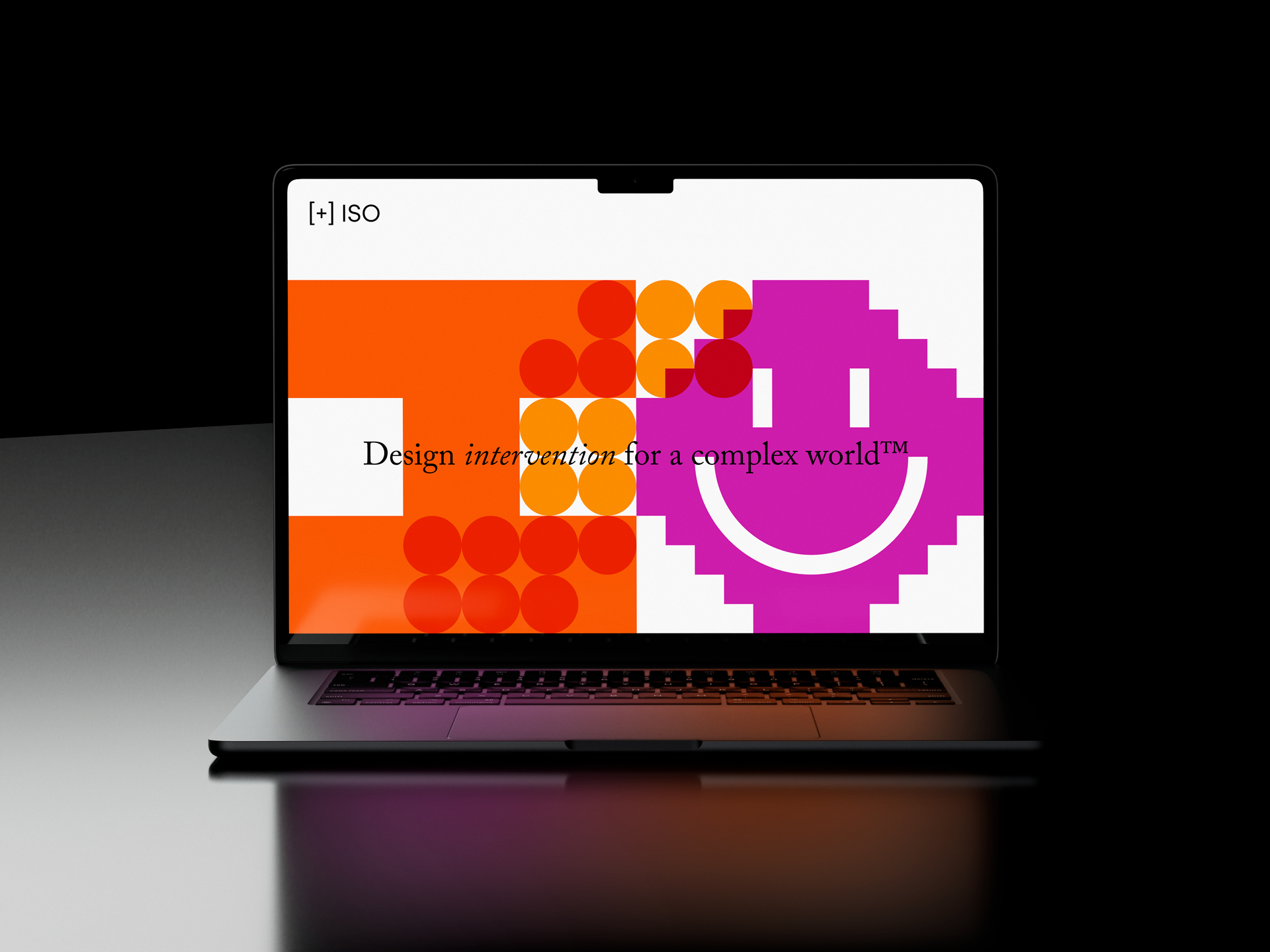
{↓} The website uses the ISO dynamic logotype and is fully responsive across all browser sizes. The ‘S’ and ‘O’ glyphs are randomly regenerated on each page refresh, creating a constantly evolving identity system.

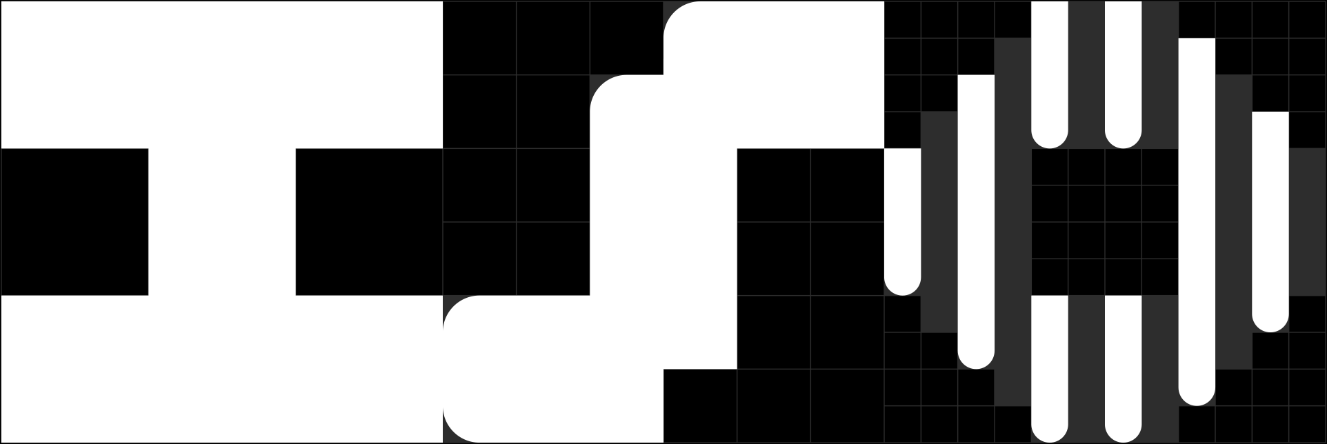
{↑} ISO alternate glyphs.
The ISO logo is designed as a dynamic system, featuring a set of alternate glyphs that can be interchanged to introduce a continual sense of movement and transformation within the mark.
{↓} ISO tagline.

{↓} The ISO primary colour palette comprises nine core colours, designed to give the identity a vibrant and energetic visual presence.

{↑} ISO copy.
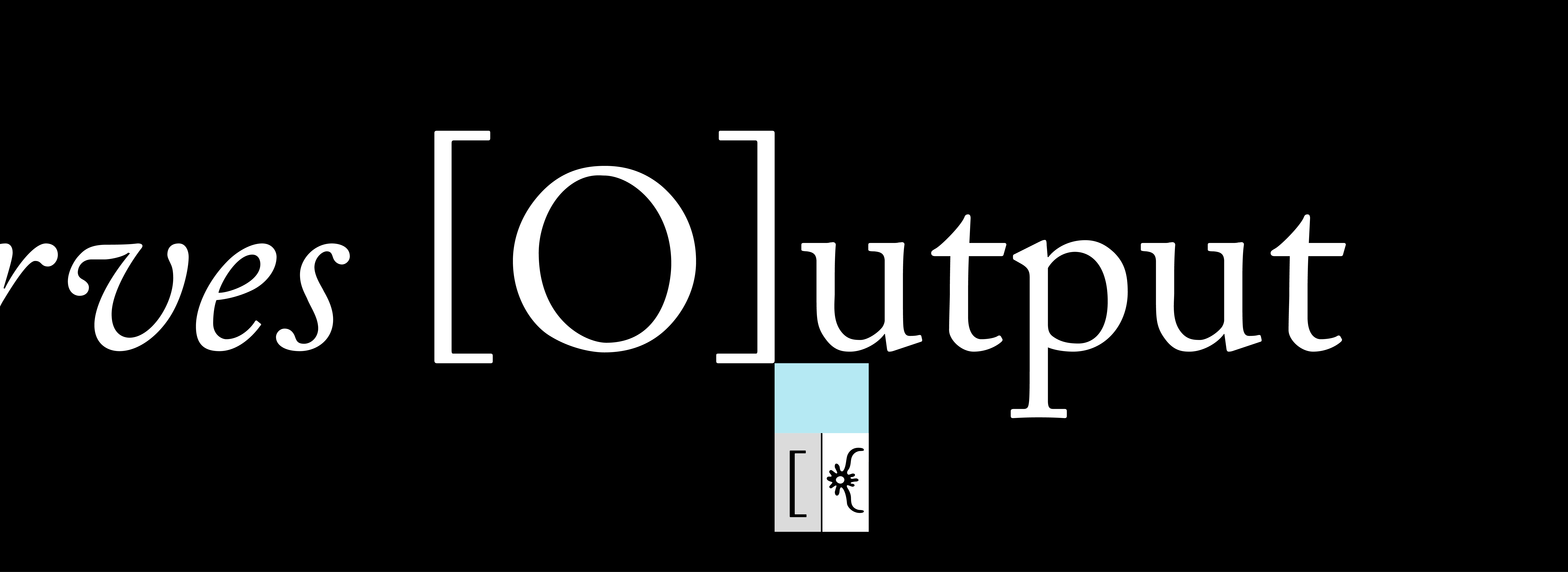
{→}{↓} Alternate 'O' glyph.

{←}{↑} The ISO primary colours can be overlaid using a ‘multiply’ blend mode to generate a secondary colour palette. This approach allows the palette to interact dynamically, producing deeper tonal variations and expanded chromatic combinations while maintaining consistency with the core identity system.
{↓} The ISO visual identity uses two very distinct typefaces: FT Regola Neue and Adobe Caslon Pro.

{↑} FT Regola Neue (Light and Regular) is used for informational text, while Adobe Caslon Pro (Regular and Italic) is reserved for more emotive, expressive copy.
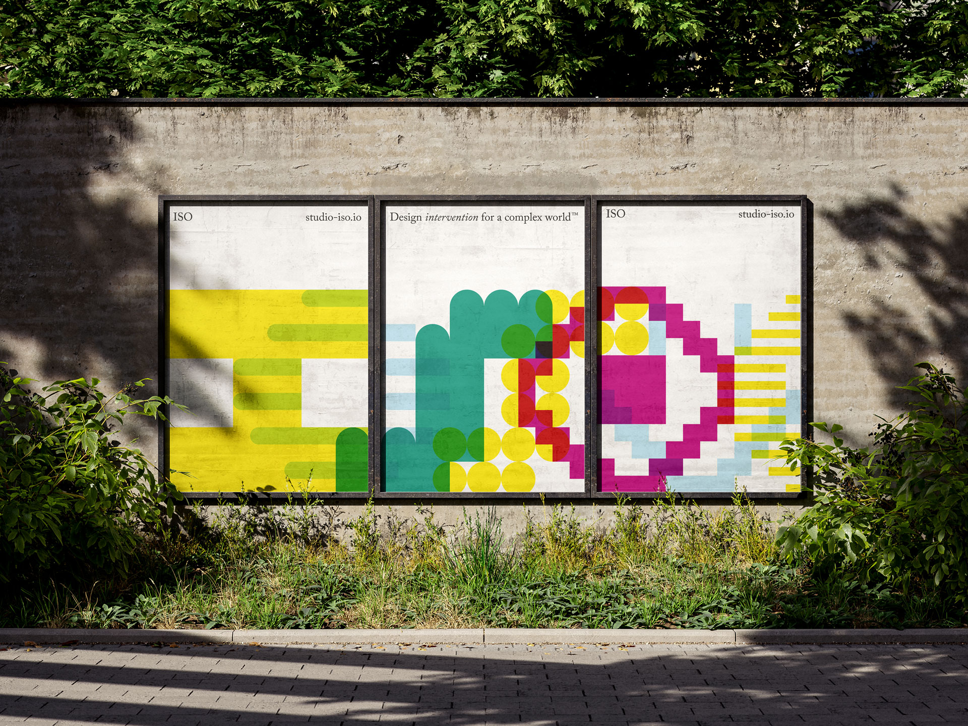
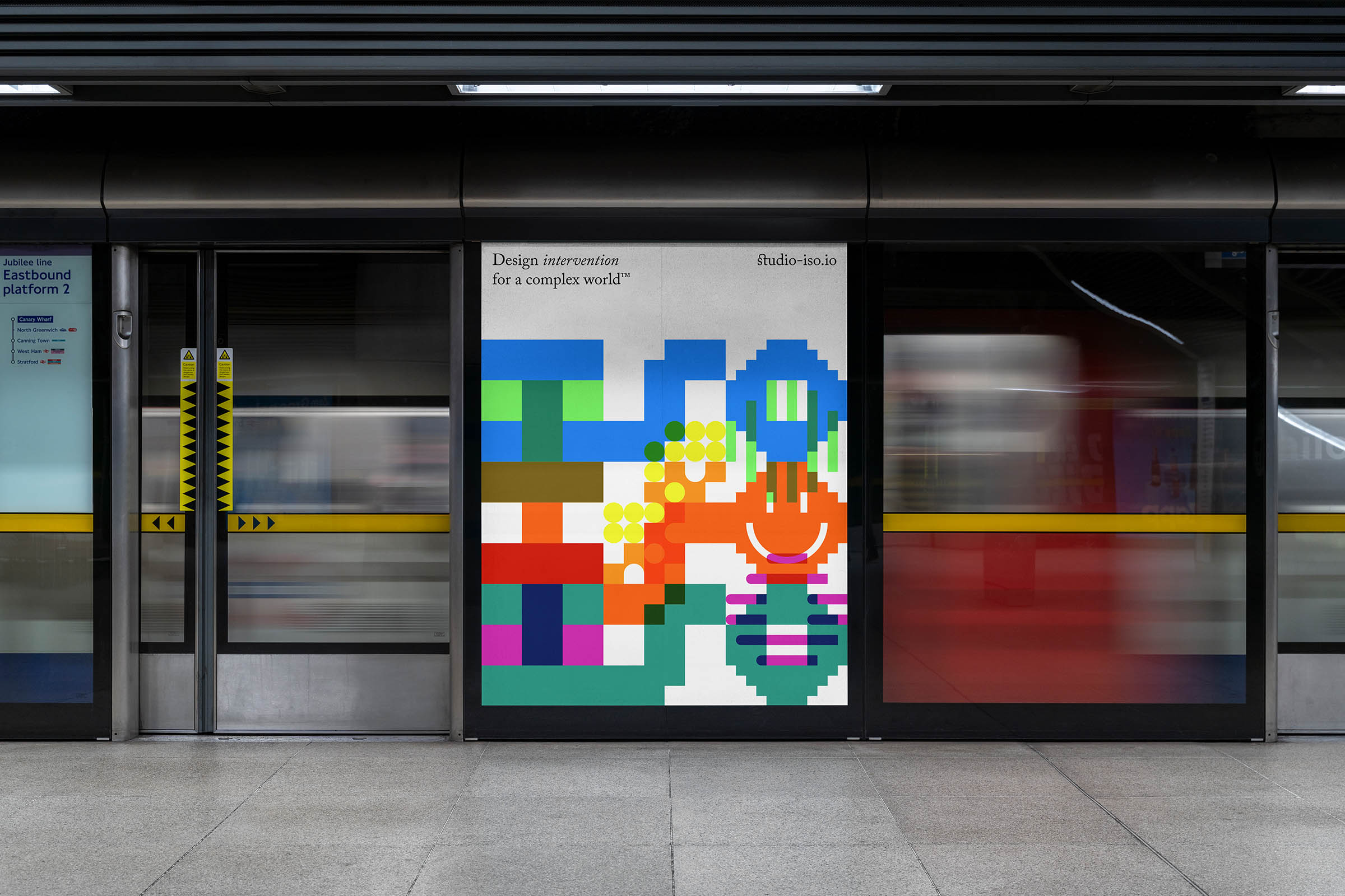
{→}{↓} ISO posters extend the identity into bold, graphic compositions that balance clarity with experimentation. Built from the system’s core elements—dynamic glyphs, grid structures, and layered colour—the posters explore scale, rhythm, and contrast to create visually striking communications.
{↑} A fully responsive website, designed and built to function seamlessly across all browser sizes and device types.
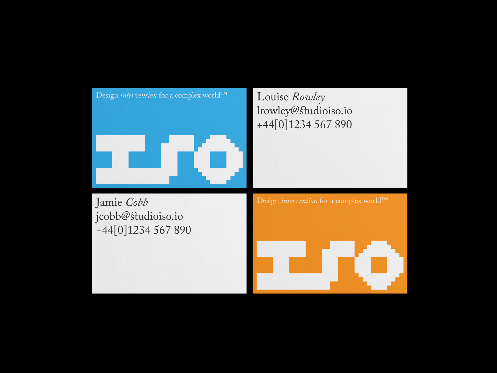
{↓} Business cards.
{←}{↑} Each presentation cover is subtly unique, with the logo evolving across every iteration.
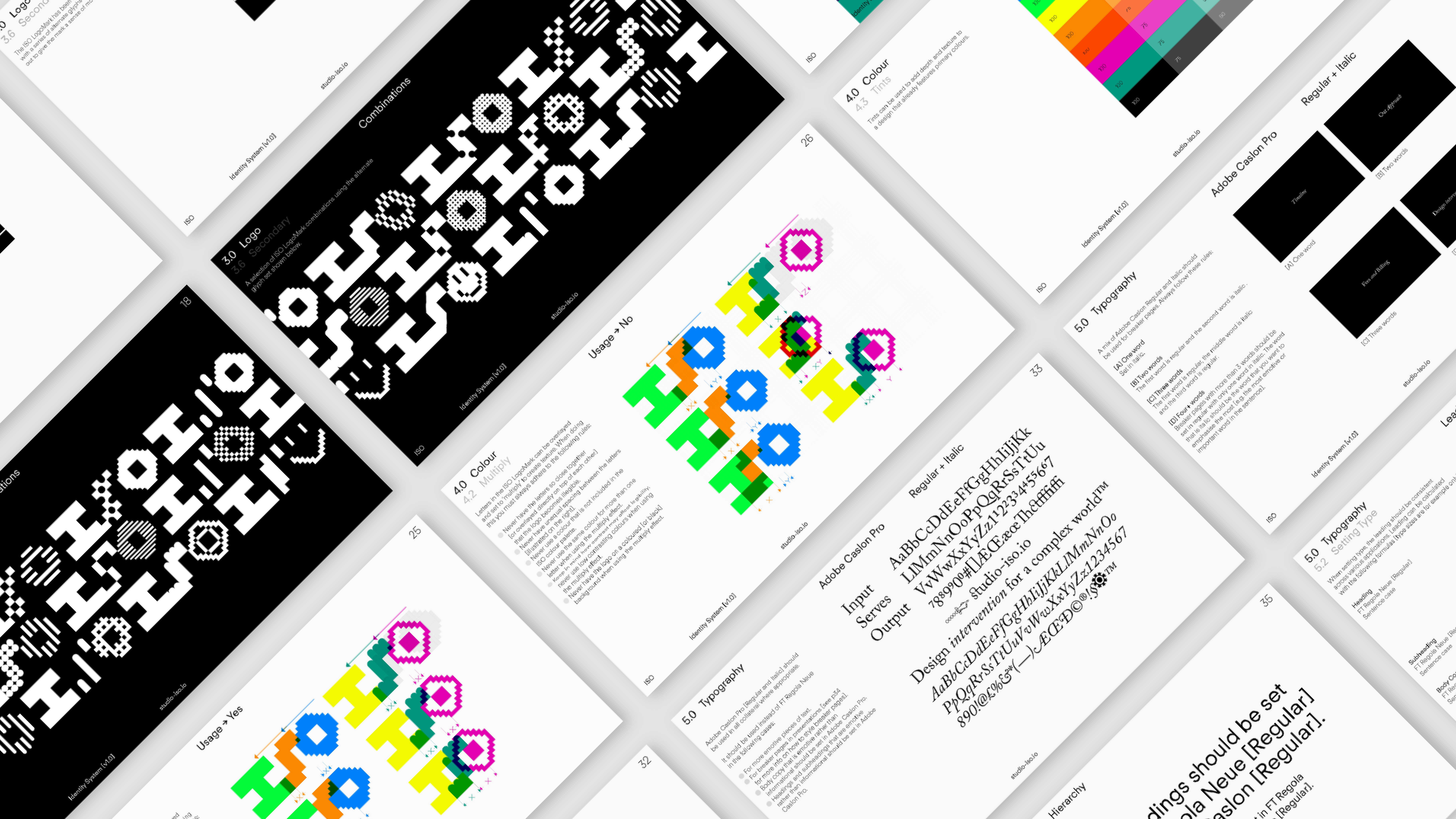
{←}{↑} The brand guidelines define the ISO identity system, setting out how its core visual elements—typography, colour, grid, and the dynamic logo—work together across applications. They provide a clear yet flexible framework, ensuring consistency while allowing for variation through the evolving glyph system, responsive layouts, and layered colour interactions.
{↓} The mobile is optimised for smaller screens, ensuring that content remains accessible and visually consistent, while still allowing for moments of variation and expression through colour layering and typographic contrast.


{↑}{→} Social media icons.
{↓} ISO poster. Logo variations are created using the dynamic glyph set, enabling the mark to shift, adapt, and evolve across applications.


