Client:
Project:


Client:
Project:
Website:
{↑} The Architectural Heritage Fund logo evolution from old to new, presented as a clear visual transition that reflects a refined identity. The redesign streamlines the mark while retaining its heritage and institutional character, balancing continuity with a more contemporary expression.
{↓} The Architectural Heritage Fund logo draws on vertical structural forms, referencing architectural supports and the built environment. It also subtly reflects the organisation’s three core pillars, distilled into a simple, upright geometry that reinforces stability and purpose.
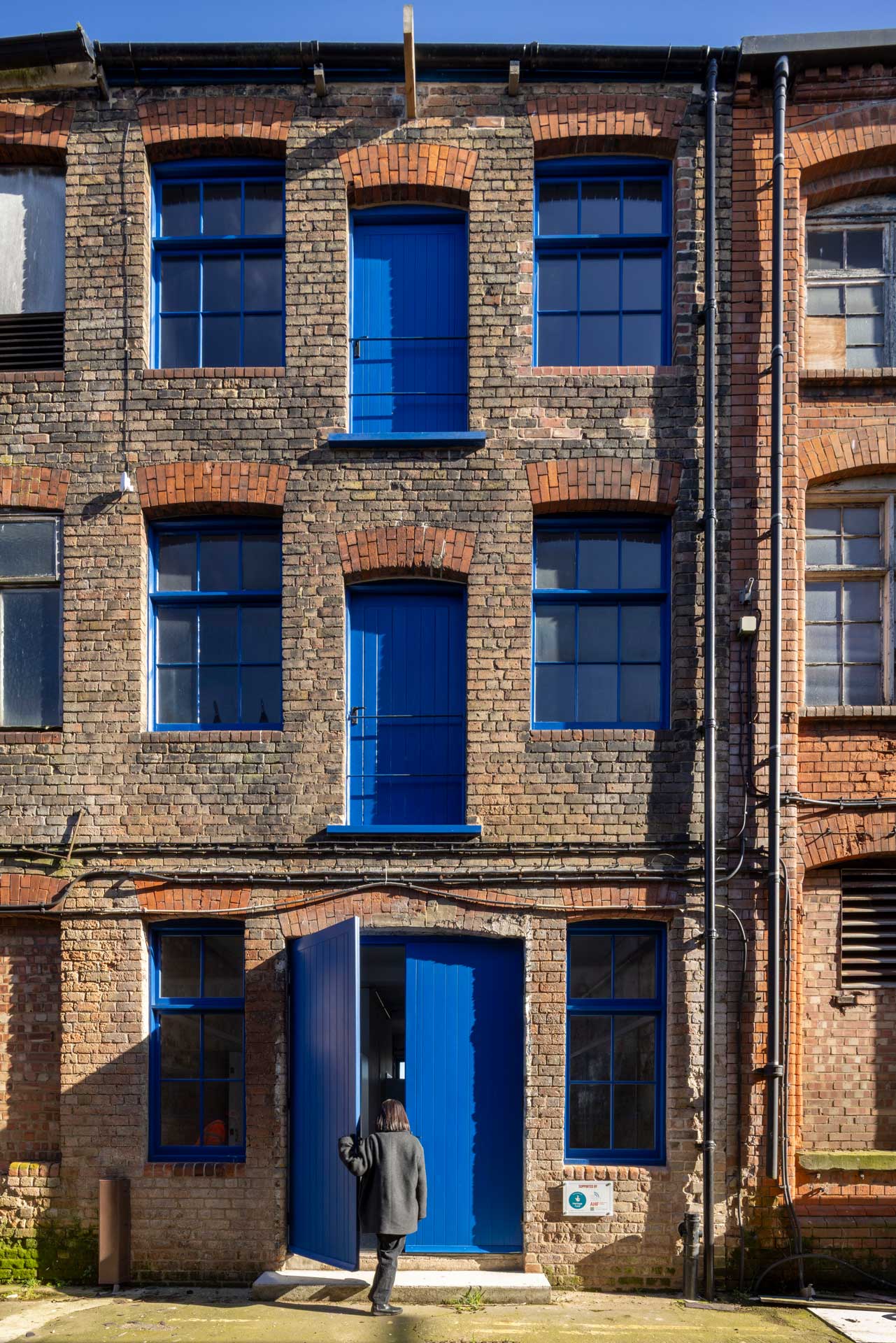
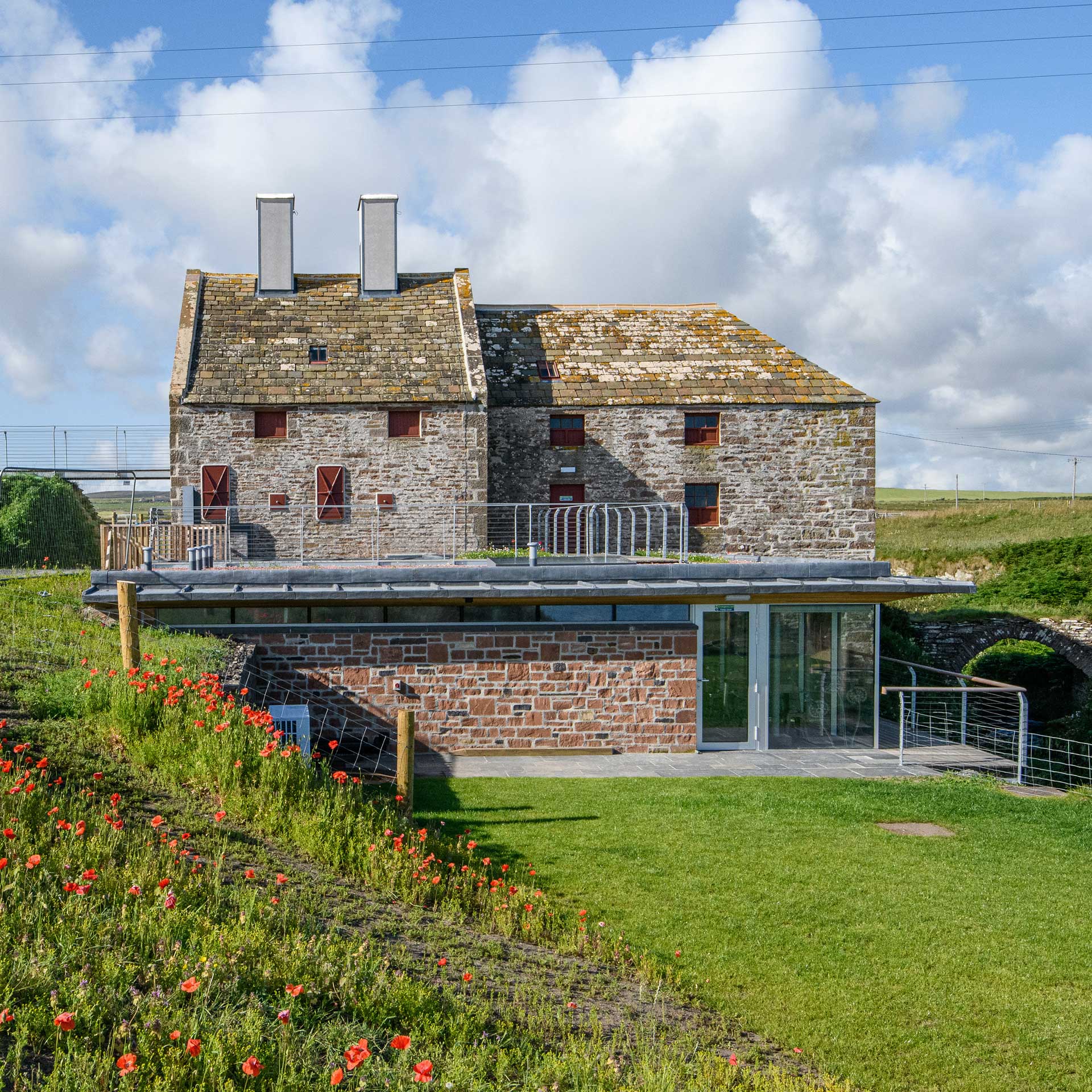
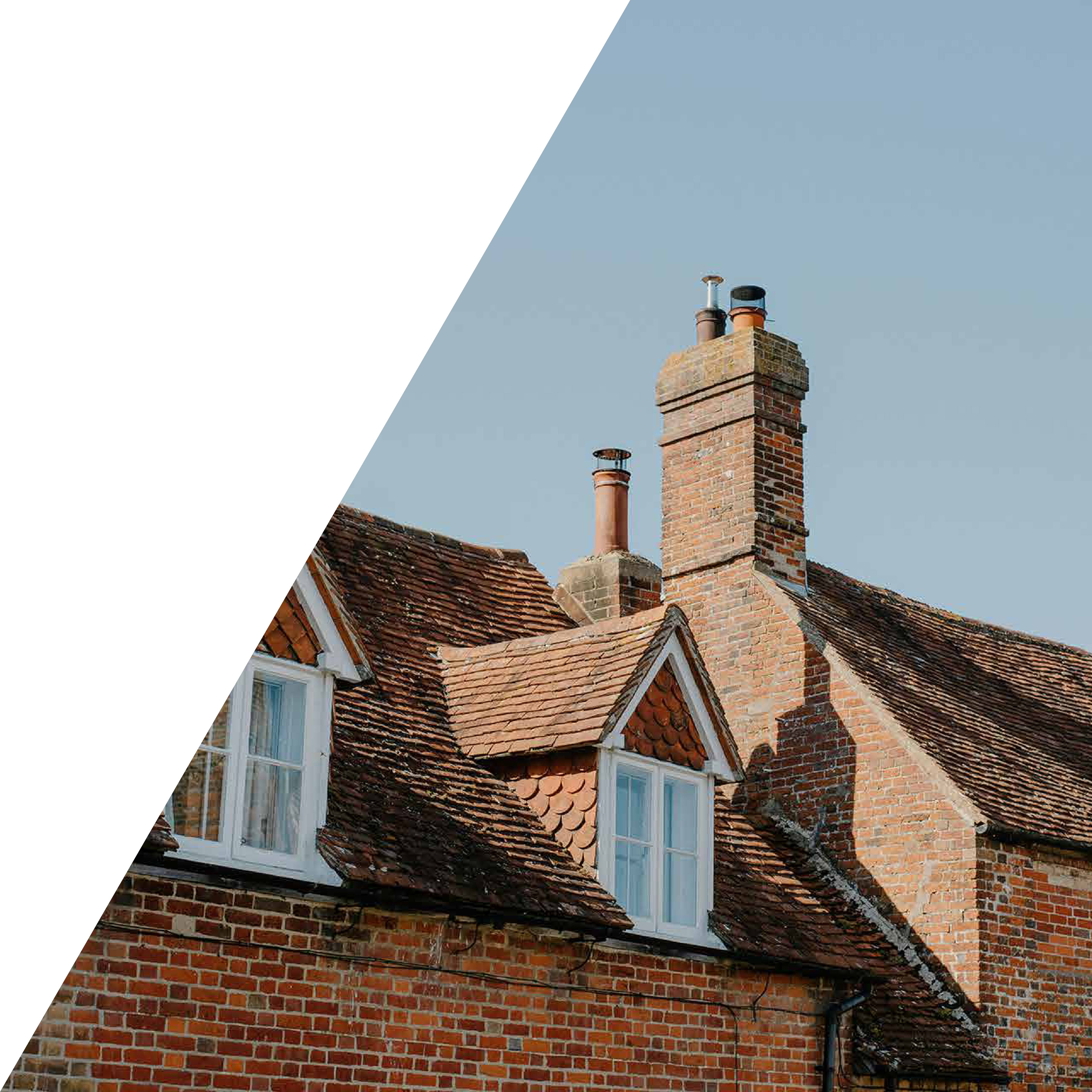
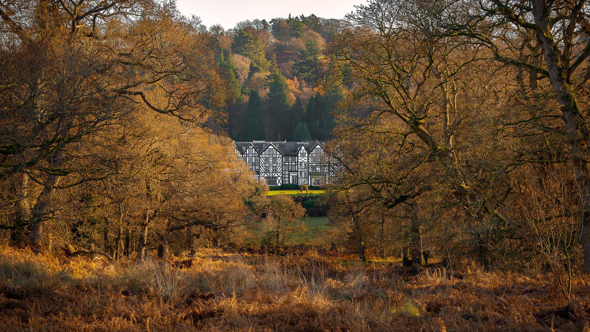
{→}{↑} The Architectural Heritage Fund promotes the conservation and sustainable re-use of historic buildings across the UK, supporting projects that bring neglected or underused structures back into meaningful use. Through funding, advice, and advocacy, it helps ensure that heritage assets are preserved not as static monuments, but as active, adaptable spaces that continue to serve communities today.
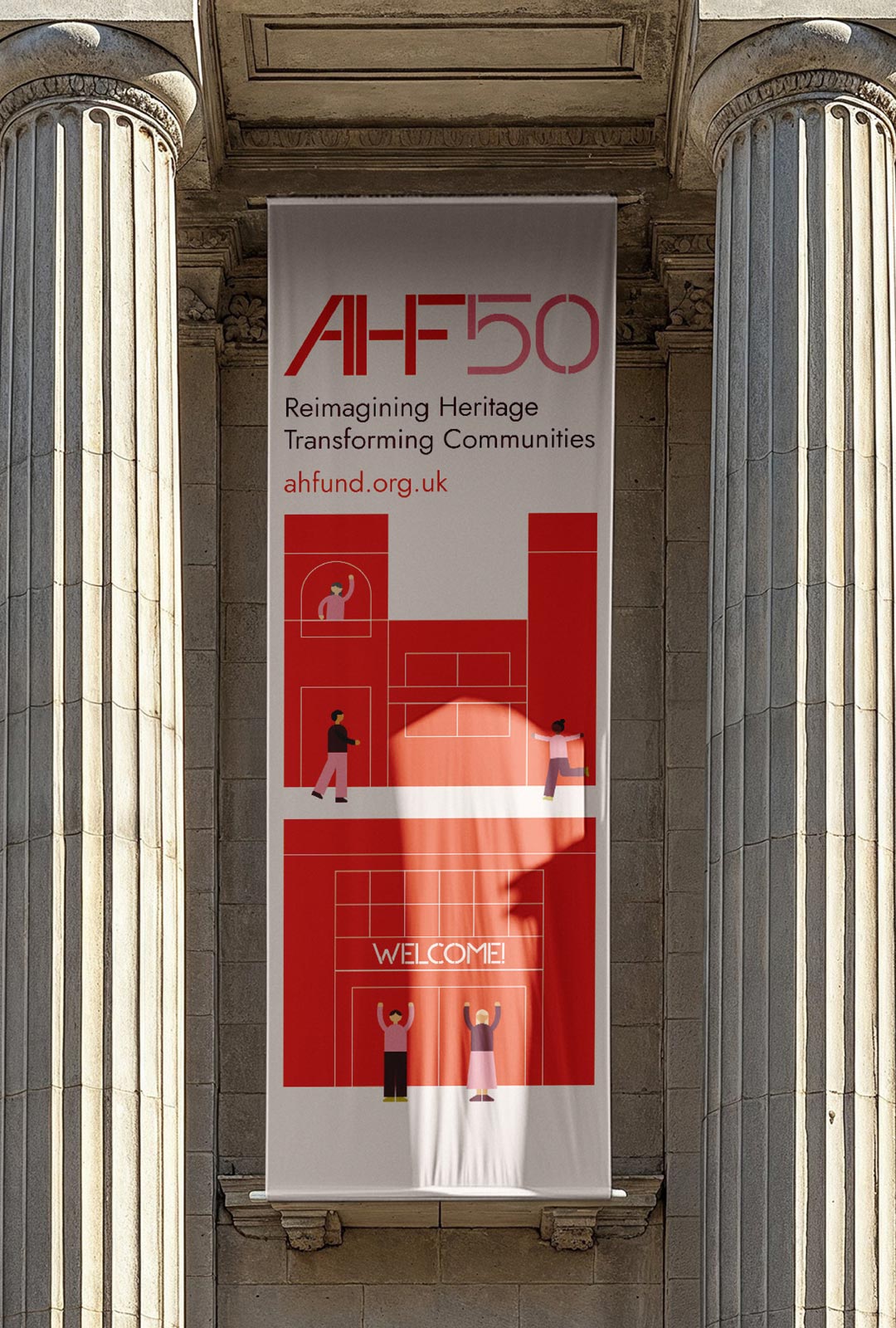
{↓} Alternate logo to mark the 50th anniversary.
{↑} Alternate logo to mark the 50th anniversary.

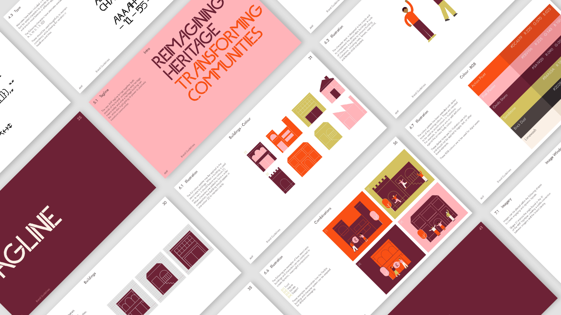
{↑} Full character set of AHF Stencil, the custom typeface at the core of the Architectural Heritage Fund identity. The typography is uniquely developed for the organisation, acting as a defining visual signature that reinforces clarity, structure, and ownership across all communications.
{→}{↓} Alternate characters provide additional flexibility within the system, allowing for refined adjustments across different applications. They ensure consistent visual balance, enabling the typography to adapt to varying contexts while maintaining a coherent overall identity.
{↓} Full colour palette defining the system’s visual language, with each tone named after materials synonymous with buildings—Action Point, Pink Plaster, Oxide Stone, Sandstone, Brick Dust and Limewash. This grounding in architectural matter reinforces the identity’s connection to the built environment.

{↑} Full colour palette defining the system’s visual language, with each tone named after materials synonymous with buildings—Action Point, Pink Plaster, Oxide Stone, Sandstone, Brick Dust and Limewash. This grounding in architectural matter reinforces the identity’s connection to the built environment.

{↑} The previous tagline, “Transforming Heritage,” has been updated to better reflect the organisation’s wider impact. The new positioning highlights how saving heritage buildings also empowers local communities, supporting social, cultural, and economic renewal.
{→}{↓} A selection of shapes have been designed to house imagery. This shape mirrors the angle of the ‘A’ in the logotype, creating a subtle connection between imagery and brand identity.
{↓} The Architectural Heritage Fund delivers targeted investment that supports the sustainable reuse and long-term management of historic buildings, ensuring they are preserved and actively re-integrated into use.
{↑} Brand guidelines defining the visual and verbal system for the Architectural Heritage Fund. They establish clear principles for identity application, from typography and colour to imagery and tone of voice, ensuring consistency across all communications while allowing flexibility for different contexts. The guidelines act as a practical and strategic framework for maintaining coherence, clarity, and recognition across the organisation’s outputs.
{↑} Logo and tagline lock-up for the Architectural Heritage Fund, designed as a fixed relationship between mark and message to ensure clarity and consistency across applications. The configuration defines clear spatial rules and alignment, allowing the identity and updated positioning to function as a single, unified expression.{←} Full colour palette.
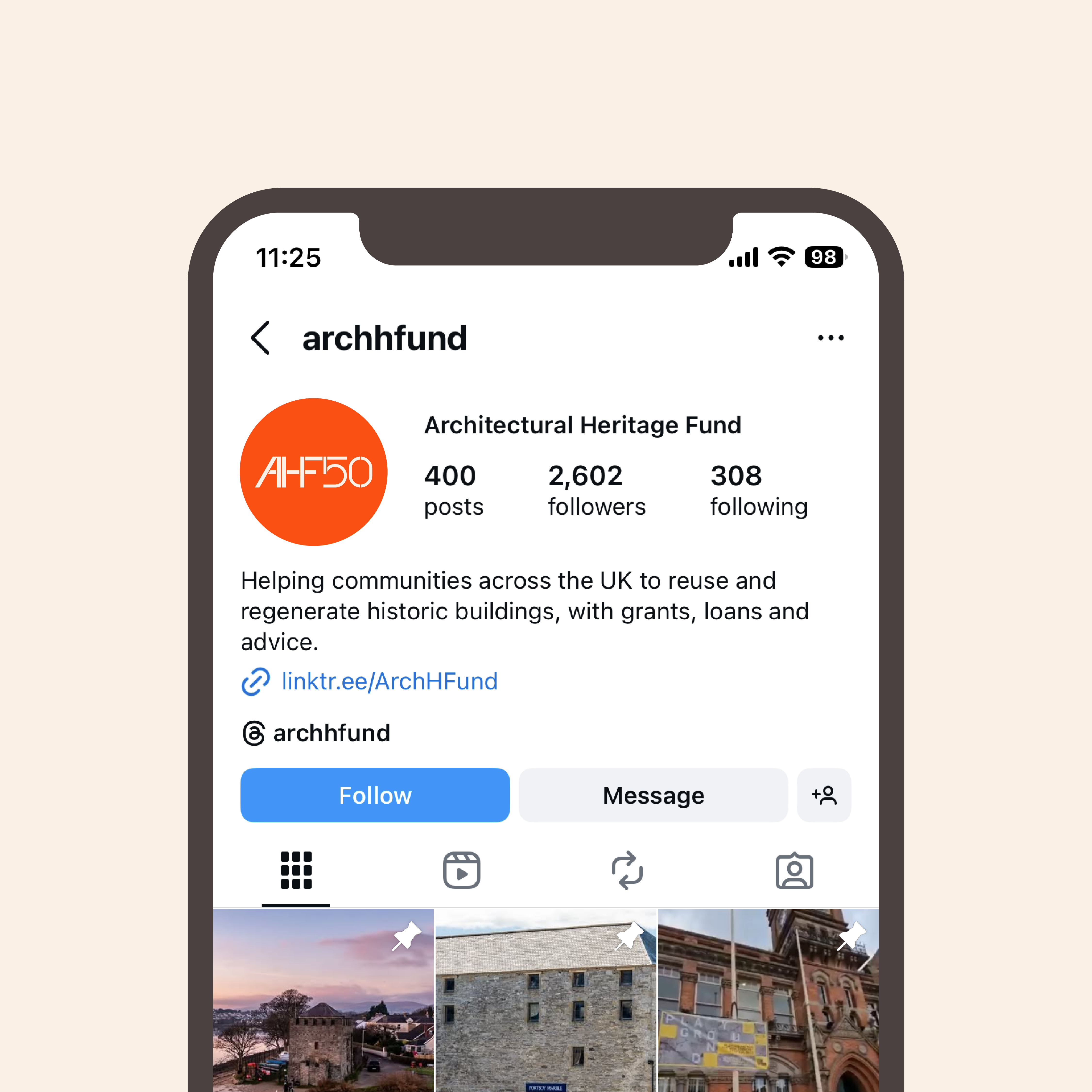
{↑} Social media icon.
{→}{↓} AHF Stencil includes a full set of diacritics.
{↓} Stencil-style illustrations establish an abstract graphic language for the Architectural Heritage Fund identity. Each reduced form operates as a modular building block, referencing construction, reconstruction, and collective progress.

{→}{↑} All buildings are constructed using a grid system, where simple shapes are combined to create dynamic, modular compositions — offering near-endless possibilities.
{↓} The character style is kept deliberately simple, designed to complement and sit harmoniously alongside the stencil-style buildings.

{←}{↓} Roll banners featuring the custom illustration.
{←}{↑} The new colour palette introduces a warmer, more refined interpretation of AHF’s original red, white, and black.
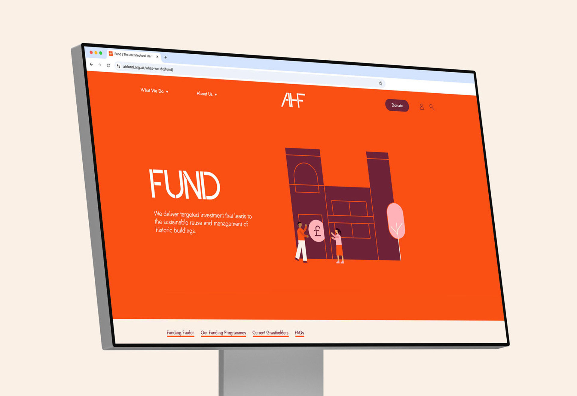
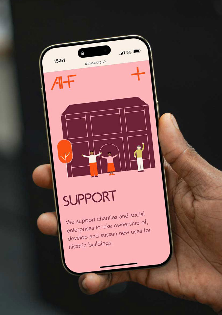
{↑}{→}{↓} Fully responsive website, designed by Studio.Build to perform seamlessly across all screen sizes, devices, and browsers.
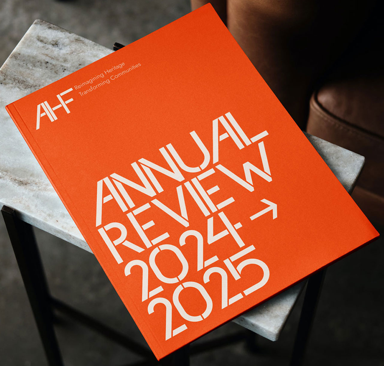
{↑}{→}{↓} AHF Annual Review — a comprehensive snapshot of the year, bringing together key achievements, milestones, and impact. It distills performance, partnerships, and progress into a clear, engaging narrative, offering stakeholders a transparent view of where AHF has been and where it’s heading next.
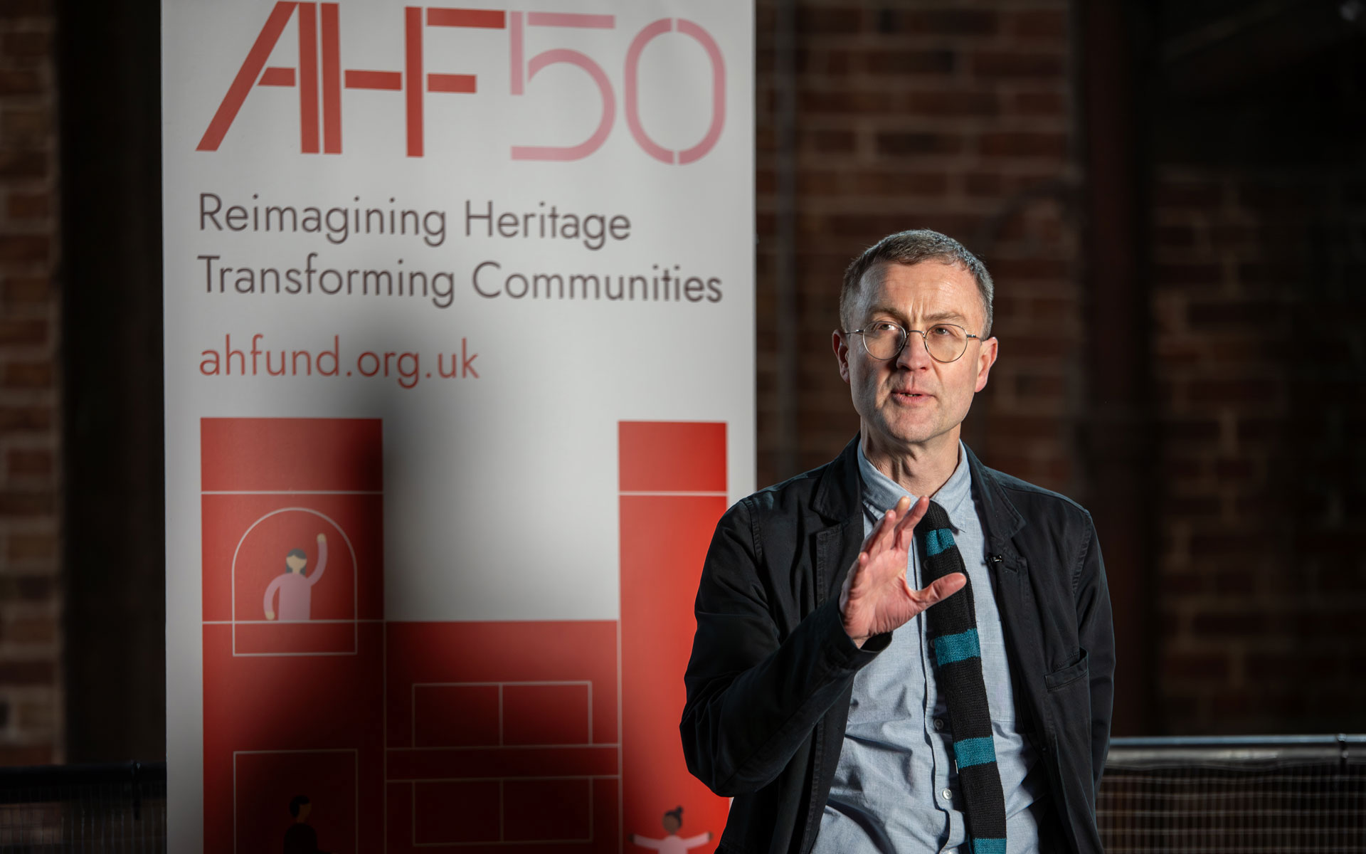
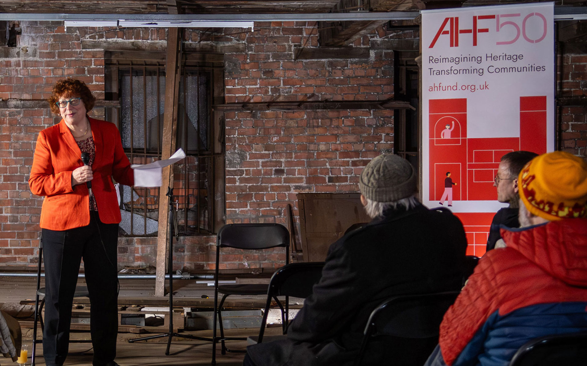
{↑} To mark their 50th anniversary, AHF launched ‘50 Years of Reimagining Heritage’, a touring exhibition exploring the impact of heritage reuse on people and communities across the UK. Photography by Argyll Images.


